|
|
Post by LaFille on Nov 24, 2009 5:38:14 GMT
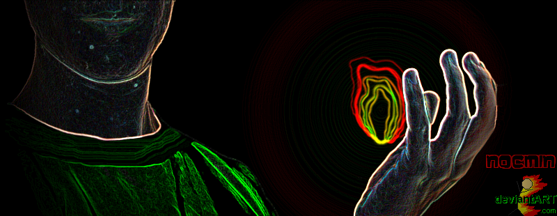
WIP = Work In Progress. This is what I had been beginning as layout for the contest (based in part on an older WIP - I'm not as quick as coming up with that in 2 days, far from it)... ...And since Elliot didn't accept the deal I offered, it shall remain that way and not be entered in the competition.  I post this here both to annoy him ;D and show what can be done, thinking it might inspire people who'll participate. Please click to see this full size though, because it looks really not as it should when shrunk.   All the bar effects and the background are made using seamless-tileable images; if there are any questions I'll can post examples showing what I mean. Just know that with similar background effects there is 1 slight "downside" though, and it's that the board with has to be static, that is not automatically adjusted in width to the browser window. Enjoy!  |
|
|
|
Post by Ubereil on Nov 24, 2009 9:23:06 GMT
I like the chaos symbols. Well, and the rest of the theme as well.  Übereil |
|
|
|
Post by Elliot Kane on Nov 24, 2009 10:31:47 GMT
Black and gray... I think I'm filing that one under 'lucky escape' ;D
|
|
|
|
Post by janggut on Nov 24, 2009 10:39:41 GMT
@ Fille -> grey is so YUMMY!! ;D thanks for proving that grey can look good too! |
|
|
|
Post by Glance A'Lot on Nov 24, 2009 12:05:45 GMT
Does that mean we can now rightfully call her 'the grey eminence of chaos'?  |
|
|
|
Post by Hildor on Nov 24, 2009 12:56:35 GMT
I like it! The Chaos symbols are very good too.
btw: the adds that are shown on this forum can be blocked by a firefox addon called Adblock Plus. Presumably with other add blocking addons for any other browser too.
|
|
|
|
Post by Elliot Kane on Nov 24, 2009 14:49:37 GMT
Does that mean we can now rightfully call her 'the grey eminence of chaos'? Given what that does to my eyes, I'd prefer 'the gray menace' ;D |
|
|
|
Post by killerzzz on Nov 24, 2009 21:50:45 GMT
Actually, guys, it's dark and light bluish off-greys. I too like it. Killerzzz |
|
|
|
Post by twoheadedragon on Nov 25, 2009 8:47:23 GMT
Nice going Fille, it's awesome!  |
|
|
|
Post by Galadriel on Nov 25, 2009 14:31:32 GMT
My vote goes to Fille's design. End of line.
|
|
|
|
Post by Ubereil on Nov 25, 2009 15:09:44 GMT
So do mine. Mostly because it's the only design so far though...
Übereil
|
|
|
|
Post by Elliot Kane on Nov 25, 2009 15:35:49 GMT
You might actually want to wait for someone to enter the contest BEFORE voting. Fille put this up as the design she is NOT entering, if you read what she says...
|
|
|
|
Post by LaFille on Nov 25, 2009 16:22:10 GMT
Yeah, because Elliot wants to keep his snowflakes, flashy colors and NES buttons. Seriously, thanks for the comments; I'm glad most of you liked.  jang, I prefer neutral/muted colors for websites too, especially when the content tends to bear vivid colors. There's a reason why the majority of websites are predominently black, white, grey, muted blue or beige... It's just more functional; it drives the attention where it needs to be, that is on the content, and avoids assaulting the senses. Glance... We all know by now that there's only one eminence here, and no room for more. ;D Hildor, I had tried AdBlock but it was blocking stuff I needed and had another inconvenience that I don't remember, so I removed it. It's a great little tool to have though.  |
|
|
|
Post by Elliot Kane on Nov 25, 2009 16:37:36 GMT
Elliot also wants to make sure the competition is open to all members of Chaos, not just those who are Graphics Geeks ;D |
|
|
|
Post by Ubereil on Nov 25, 2009 17:16:53 GMT
You might actually want to wait for someone to enter the contest BEFORE voting. Fille put this up as the design she is NOT entering, if you read what she says... I was busy looking at the pictures, ok?!?  Übreil |
|
|
|
Post by Galadriel on Nov 25, 2009 17:18:28 GMT
You might actually want to wait for someone to enter the contest BEFORE voting. Fille put this up as the design she is NOT entering, if you read what she says... |
|
|
|
Post by Elliot Kane on Nov 25, 2009 17:23:16 GMT
Ube - should I pretend to be surprised? ;D
Gal - well, that's fair enough, I suppose... ;D
|
|
|
|
Post by peterh on Nov 26, 2009 21:25:31 GMT
That's a good layout, Fille. Too bad it's not entered into the contest.
btw - a question. Can the rest of us use that kind of background effects as well or does it have to be static colors? I'm not sure if Elliot's able to incorporate such things even with his awesome amin powers in mind.
|
|
|
|
Post by Hand-E-Food on Nov 26, 2009 21:56:05 GMT
btw - a question. Can the rest of us use that kind of background effects as well or does it have to be static colors? I'm not sure if Elliot's able to incorporate such things even with his awesome amin powers in mind. I think we can change the background (currently the soft blue diamonds), but the title bars (eg. "Forum Name") have to be a single colour, unlike in La Fille's design. |
|
|
|
Post by Elliot Kane on Nov 26, 2009 22:32:38 GMT
HEF would be correct |
|


 I post this here both to annoy him ;D and show what can be done, thinking it might inspire people who'll participate. Please click to see this full size though, because it looks really not as it should when shrunk.


 .com
.com